
TL; DR:
This blog is designed for B2B marketers, founders, CMOs, demand generation teams, LinkedIn advertisers, and marketing professionals who want to improve campaign performance by using the correct LinkedIn ad image sizes, formats, and creative best practices.
- Explains LinkedIn Ad Image Specifications Clearly: The article provides a comprehensive breakdown of LinkedIn ad image sizes, aspect ratios, file formats, character limits, and device compatibility for single-image ads, carousel ads, and mobile-first creatives.
- Highlights the Business Impact of Proper Image Sizing: Readers learn how correctly sized images improve click-through rates, reduce wasted ad spend, enhance brand credibility, support mobile performance, and contribute to stronger B2B lead generation outcomes.
- Identifies Common Creative and Campaign Mistakes: The blog outlines frequent errors such as using incorrect dimensions, relying on low-resolution images, ignoring mobile-only formats, overcrowding creatives with text, and failing to align image formats with campaign objectives.
- Provides Strategic Best Practices for B2B LinkedIn Advertising: The article recommends using square creatives as the default format, testing multiple aspect ratios, aligning visuals with funnel stages, creating reusable design templates, and integrating creative strategy with broader positioning, branding, and lead-generation efforts through Ad Momenta.
Getting your LinkedIn ads image size wrong is one of the fastest ways to waste ad spend on a platform where every impression counts. A pixelated banner, an awkwardly cropped square, or a vertical creative that never shows up on desktop can quietly kill a campaign before it even gets a fair test. For B2B marketers competing for the attention of decision-makers, image specs are not a design afterthought; they are part of the media plan. This guide breaks down every LinkedIn ads image size, format, and character limit you need, along with the strategy to actually make those dimensions perform.
Direct Answer: What is the Right LinkedIn Ads Image Size?
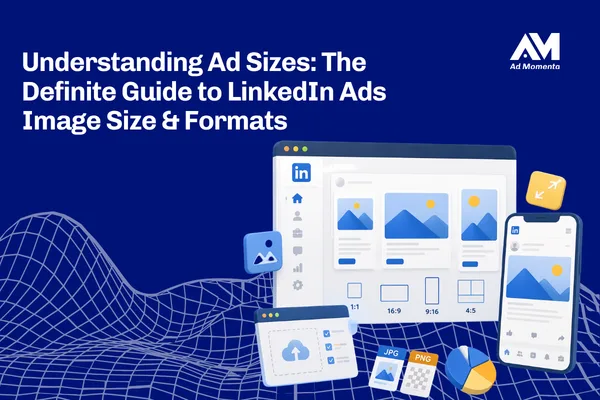
The recommended LinkedIn ads image size depends on the format. For single image ads, use 1200 x 628 pixels (1.91:1 ratio) for landscape, 1200 x 1200 pixels (1:1 ratio) for square, or 720 x 900 pixels (4:5 ratio) for vertical, mobile-only creatives. Carousel ads should use 1080 x 1080-pixel square cards. All formats accept JPG, PNG, or non-animated GIF files, capped at 5 MB for single image ads. Square is the safest default since it displays cleanly across both desktop and mobile without cropping.
What is LinkedIn Ads Image Size?
LinkedIn ads image size refers to the exact pixel dimensions, aspect ratios, and file specifications that LinkedIn requires for visual content in Sponsored Content campaigns. Every ad format on LinkedIn, from single image ads to carousels and event ads, has its own recommended and minimum size.
Getting the LinkedIn ads image size right means your creative displays exactly as designed, without LinkedIn’s system cropping, stretching, or compressing it. For a founder or marketing head without a design background, think of it as the technical container your brand message has to fit inside. Miss the container size, and even great creative underperforms.
Why LinkedIn Ads Image Size Matters for Modern Businesses
LinkedIn ads image size is not just a technical checkbox. It directly affects how your brand is perceived and how well your campaign converts.
Here is why it matters:
- First impressions form in seconds. A stretched or blurry image signals a lack of professionalism before a prospect reads a single word of copy.
- Correct sizing protects your budget. Wrongly sized creative gets auto-cropped, which can cut off logos, faces, or key messaging you paid to display.
- Mobile behavior demands the right ratio. Most LinkedIn traffic is now mobile, so square and vertical formats often outperform horizontal ones simply because they occupy more screen space.
- Consistency builds brand trust. Decision-makers scroll past dozens of ads. Clean, correctly sized visuals make repeated impressions feel intentional rather than accidental.
For B2B brands where a single lead can be worth lakhs in pipeline value, this level of technical precision is directly tied to ROI.
How LinkedIn Ads Image Size Works
Understanding how LinkedIn ads image size works in practice makes it easier to plan creative production without back-and-forth revisions.
- Choose your ad format first. Single image, carousel, and document ads each have separate specs.
- Pick the aspect ratio for your objective. Landscape (1.91:1) suits desktop-heavy campaigns, square (1:1) works across both desktop and mobile, and vertical (4:5) is built for mobile-only delivery.
- Design at the recommended resolution. Use 1200 x 628 for landscape, 1200 x 1200 for square, or 720 x 900 for vertical to avoid upscaling or pixelation.
- Check file type and size. LinkedIn accepts JPG, PNG, or non-animated GIF, with a 5 MB cap for single image ads and up to 10 MB per card for carousels.
- Respect character limits alongside image size. Headlines are capped at 70 characters and intro text at 150 characters, so copy and creative need to be planned together.
- Preview across devices before publishing. Vertical images do not deliver to desktop at all, so always confirm placement behavior in Campaign Manager before launch.
Here is a quick reference table:
| Format | Aspect Ratio | Recommended Size | Delivers To |
| Landscape | 1.91:1 | 1200 x 628 px | Desktop and mobile |
| Square | 1:1 | 1200 x 1200 px | Desktop and mobile |
| Vertical | 4:5 | 720 x 900 px | Mobile only |
| Carousel card | 1:1 | 1080 x 1080 px | Desktop and mobile |
Key Benefits of Getting LinkedIn Ads Image Size Right
- Higher click-through rates. Correctly sized images display in full without cropping, so your intended visual hierarchy and CTA remain visible.
- Lower cost per lead. Ads that render properly avoid wasted impressions on distorted creative, improving overall campaign efficiency.
- Stronger brand recall. Sharp, well-composed visuals reinforce brand professionalism, which matters more in B2B where trust drives conversion.
- Better cross-device performance. Choosing the right LinkedIn ads image size per placement ensures your message lands whether a prospect is on a laptop or scrolling on mobile.
- Faster ad approval. Specs that match LinkedIn’s requirements reduce the chances of rejection or delayed review during campaign launch.
Common Mistakes Businesses Make with LinkedIn Ads Image Size
- Using one image size for every placement. A single landscape image reused across square and vertical placements often gets cropped in ways that cut off logos or faces.
- Ignoring mobile-only vertical delivery. Teams design vertical creative expecting desktop reach, not realizing it never appears there.
- Overloading images with text. LinkedIn’s audience reads captions closely, so text-heavy images often get flagged or simply underperform against clean visuals.
- Uploading low-resolution images. Anything below the minimum pixel dimensions gets stretched, leading to blurry, unprofessional creative.
- Skipping the LAN description field. Campaigns using LinkedIn Audience Network without the required description see reduced reach or ad rejection.
- Not testing formats before scaling budget. Businesses commit full budget to one aspect ratio without validating performance across square, landscape, and vertical first.
- Treating image size as a design-only decision. When media buyers are not looped in on aspect ratio choices, campaigns launch with mismatched creative and placement strategy.
Each of these mistakes quietly erodes lead quality, click-through rate, or brand perception, even when the underlying offer and targeting are strong.
Best Practices to Get Better Results from LinkedIn Ads Image Size
- Default to square (1:1) creative when running a single campaign across both desktop and mobile, since it avoids cropping on either surface.
- Design at full recommended resolution, not the minimum, to keep images sharp on high-density mobile screens.
- Keep text minimal on the image itself and let your headline and intro text carry the message, since LinkedIn’s algorithm and audience both favor clean visuals.
- Include real people where relevant. Authentic, non-stock imagery consistently performs better for engagement on a professional network.
- Refresh creative every 2 to 4 weeks to avoid ad fatigue, especially once frequency climbs for a given audience segment.
- Align image size choices with AI search behavior. Clear, well-structured landing pages linked from your ads help both LinkedIn’s algorithm and AI search engines understand context, which supports visibility beyond the platform itself.
- Test visuals before headlines or CTAs, since creative typically accounts for the largest share of performance variance in LinkedIn campaigns.
LinkedIn Ads Image Size Strategy for B2B Brands
B2B brands cannot approach LinkedIn ads image size the way a D2C brand approaches Instagram or Facebook creative. The buying committee, sales cycle, and content expectations are different, and the visual strategy needs to reflect that.
For founders, CMOs, and marketing teams, this means:
- Prioritize clarity over flash. B2B decision-makers respond to credibility signals like data points, client logos, or clear value propositions rendered cleanly within the correct aspect ratio.
- Match format to funnel stage. Use landscape or square single image ads for top-of-funnel awareness, and consider document ads with a strong first-page cover for mid-funnel content like whitepapers or case studies.
- Standardize a creative system. Instead of designing ad-by-ad, build templates at 1200 x 1200 and 720 x 900 so campaigns can launch faster without compromising on LinkedIn ads image size accuracy.
- Coordinate with sales messaging. Since B2B ad creative often feeds account-based marketing, image size decisions should align with how the same visuals are reused in outreach or nurture sequences.
- Plan for LinkedIn Audience Network reach, since B2B campaigns often extend beyond the main feed, which means the LAN description field needs to be part of the creative checklist, not an afterthought.
Why Choose Ad Momenta for LinkedIn Ads Image Size and Creative Strategy
Getting LinkedIn ads image size right is a technical detail. Building a campaign that actually generates pipeline is a strategic one, and that is where Ad Momenta comes in.
Ad Momenta works with founders, CMOs, and marketing teams as a strategic partner, not just an execution vendor. That means Ad Momenta helps brands:
- Simplify complex positioning so your message is clear before a single ad is designed
- Build differentiated branding that stands out in a crowded B2B feed
- Create content that clicks, backed by the right format and image size for every placement
- Run performance campaigns that convert, not just campaigns that look good in a report
- Improve lead generation and conversion quality across the full funnel
- Build momentum by making positioning, branding, and marketing execution work together instead of in silos
If your LinkedIn campaigns are underperforming and you are not sure whether it is the offer, the targeting, or the creative, Ad Momenta brings the strategic lens to diagnose it and the execution capability to fix it.
Final Thoughts
LinkedIn ads image size might seem like a small technical detail, but it directly shapes how your brand is perceived and how efficiently your budget converts into leads. Square creative at 1200 x 1200 pixels remains the safest default for cross-device delivery, while vertical and landscape formats each have a specific role depending on your campaign objective. The businesses that treat image size as part of strategy, not just design, consistently see better performance from their LinkedIn spend.
If you want a LinkedIn ad strategy built on the right positioning, creative, and technical execution from day one, connect with Ad Momenta to see how a coordinated approach can improve your results.